
Welcome back to the Humm Baby Baseball Channel and today we’ll be ranking all 28 of the City Connect Uniforms that have been unveiled so far from worst to best.
Wost: The Los Angeles Dodgers (Original Design)
I can hear it now – bro, that’s just cuz you’re a Giants fan. Absolutely. But, seriously, the all blue look just doesn’t do it for me; they look like pajamas on first glance. Also, the text on the cap is too much putting the entire team name on there, it doesn’t even say LA for Los Angeles. It’s cool that the front of the jersey says Los Dodgers, but overall, there’s not much unique about it – you can barely notice the spray paint effect on the sleeves and I get they didn’t wanna stray too far the classic Dodger look. Los Angeles is a city with so much going on; it’s crazy they couldn’t do a little more with their City Connects – I genuinely think these city connects are the worst to come out so far.
#28 The Detroit Tigers
At first glance, I just thought this one looked pretty ugly and reminded me of some of the wacky minor league uniforms during random promotions where they wear a wild looking uniform for one game then auction them off autographed for fans to buy. Of course, they were going to go with a motor city theme, but the tire tracks are a bit much. There’s only dark blue and black, and it could’ve used some hot orange somewhere to make it pop a little more. It just looks cringe to me as a jersey, but many of these city connects don’t have the best jerseys but the cap makes up for it. In this case, this cap literally just says “Detroit” in the most plain font available. I can’t even imagine how this got approved. I can literally make the same cap in 10 seconds on Photoshop Elements.
#27 The Baltimore Orioles
The Orioles decided to go super-simplistic with their City Connect Design and the first thing I thought of when I saw this was the old 19th century jerseys that had nothing but the city name across the chest. The Orioles City Connects do have a colorful mosaic design on the inside – you know, the part that you can’t see. There are lots of abstract explanations to explain all the meaning behind this design, but ultimately, it’s just too plain. I like the attempt to go old school style, but that’s for Turn-Back-the-Clocks games – the City Connect should represent what is exciting and vibrant about the city. I don’t hate the uniforms in isolation but as a City Connect Jersey, it falls short.
#26 The Chicago Cubs
These uniforms are somewhat similar to the Dodgers in the all blue look, but the overall look pops a little better with the navy blue and light blue contrast. It works much better than the Dodgers look. Wrigleyville across the chest is cool and the logo that symbolizes the north, south and main branches of the Chicago River. There’s representation for all the neighborhoods of the city and overall it’s a cool look but like the Orioles, a little too simple although they did more than the O’s. The cap has a simple C with a star in the middle and looks pretty cool as well. Overall, though, I don’t love these unis and they come in at #18.
#25 The St. Louis Cardinals
The St. Louis Cardinals are a very traditional team that almost didn’t even participate in the City Connect Program. Ultimately, they decided to go for it – sort of. The only real issue with this uniform is it looks like a Spring Training uniform. They stuck with the same color scheme and traditional looking logo with the birds perched on the bat, except now it says “The Lou,” a nickname for St. Louis and in the U.K… the bathroom. They did, for the first time, use red as the primary color. The STL is nothing special although it’s a decent logo for the cap. The Cardinals decided to keep things simple, and that’s okay, but for a City Connect, I’d prefer something a little more bold.
#24 The Kansas City Royals
These ones have a similar color scheme to the Cubs, dark blue against light blue – but I like the white trim and white pants to go with it better than the all blue look. The navy blue represents several teams from the past in KC – the Athletics, Moncarchs and Blue Sox among others. And the KC logo is a cool design and the number styling is a reference to the city’s art deco architecture but overall it does come across as fairly simple and plain. Obviously, that can be a good thing; you don’t want to do too much but overall, this one is so-so, just better than the Cubs.
#23 The Los Angeles Dodgers (2024 Design)
Coming up next is the Dodgers new and much improved City-Connects, which are still nothing spectacular but for me an obvious improvement. They maintain the tradition Dodger colors and feel, but use a font that pays homage to the Dodgers original stadium after the move to the west coast, L.A. Memorial Coliseum. The cap is miles better with the interlocking D and LA logos together as one, instead of putting “Los Dodgers” which looked like too many letters to be on the front of a cap. I like the number being a different shade of blue and overall, these look nice, but they’re also nothing mindblowing. But The Dodgers did well to keep it simple while improving the previous design.
#22 New York Mets
Coming in at #22 is the New York Mets, another new reveal this season, and this one took me aback a bit because it looked more like a Yankees uniform than a Mets one. Also, the amount of gray looks a little plain at first sight. However, there are some purple accents representing the 7 line that runs to City Field. I definitely expected the jerseys to say “Queens” instead of “NYC.” After checking them out in a game, though, I have to say overall these look pretty cool. There are lots of features to connect to all of New York City. The pattern of the stripes is cool and I really love the cap with the Queensboro Bridge. Maybe they could’ve used more purple or something to make them pop a little more, but they are definitely not terrible.
#21 The Los Angeles Angels
Next up is the Los Angeles Angels, who went with a surf themed look for their City Connects, which at least represents something about the city. I like the surf-style font across the front but overall, they didn’t take any huge risks. The colors are similar to their normal colors and really, it’s just Angels uniforms with a surf-style feel. The number in the diamond looks cool along with the stripes on the sleeve but overall, despite the overall clean look, nothing really pops too much so this uniform comes in at #21.
#20 Cleveland Guardians
Next up is the Cleveland Guardians, who stuck with the same color scheme for the most part. The “CLE” on the front looks pretty cool with the home plate style lettering that is also used on the name on the back. There are several little details that add an interesting touch, but don’t really effect the overall look except the sandstone pattern, which is nice. The socks have the Guardian Statues but are only visible for players who show their socks, which is not the majority. The cap looks like a normal Cleveland Guardians cap to a non-Guardians fan. If I saw it in their team store, I wouldn’t know it was anything special. Overall, this is a solid look, but it’s also too similar to their regular uniform, although it’s different enough and better than a Spring Training uniform.
#19 The Pittsburgh Pirates
So the newest City Connect uniform comes in a little low, but I really do like the look – because I like the Pirates normal uniforms. This one seems like a cool alternate uniform you might see in Spring Training. It also reminds me of the Salt Lake Bees Triple-A team. However, there is a little more to it than meets the eye; there’s a Three Rivers logo to symbolize the intersection of the three rivers – and a checkered pattern that looks pretty cool although it’s subtle. The font of the PGH across the front looks cool and is patterned after the circular grates in the pillars of the Robert Clemente Bridge. It also has a look representative of the Steel City overall. It’s not a huge departure from their normal colors and look, but overall looks pretty clean.
#18 The Milwaukee Brewers
Moving to #18, we have the Milwaukee Brewers who took a light blue look inspired by the flag of Milwaukee, the summer skies of Milwaukee along with its grilling culture and Lake Michigan. The colors are basically the same as their normal uniform but I look like the look. The cap has the airport designation and the jersey says Brew Crew, the team’s nickname which is pretty cool although I still think every city connect should say the city name somewhere other than the cap or a nickname of the city, not the team. Overall, it’s a clean look but nothing incredibly awesome in my opinion so it comes in fairly low but not near the very bottom.
#17 The Seattle Mariners
At #17 I have the Mariners, whose City Connects seem to be getting pretty solid reception but for me, I don’t find them absolutely spectacular although they definitely look pretty cool. I don’t know the black pants completely work with the blue and yellow – the overall combo looks alright. The jersey took inspiration from or, more accurately, is the same jersey as the old Seattle Pilots with the lowercase Seattle on the front. This is cool but I didn’t think the idea of the City Connect was just to wear throwback jerseys. The trident is a cool Mariners look but again – a logo we already know. So, although this overall look is sweet; I don’t rank it too high as a City Connect because there wasn’t much original or new about it but again, it’s not a bad look overall.
#16 Minnesota Twins
This one definitely gets credit for taking a big swing, but I can’t say it’s a home run. It’s not a strikeout either, though, as it does look somewhat cool with the ripple waves and tribute to the state of Minnesota and its 10,000 lakes, which it blatantly says on the side of the cap. I think the waves could’ve been a little more subtle though. I like the yellow trim and MN logo looks pretty cool as well. The logo on the front of the cap looks pretty sick and the bottom of the brim has a depth map of Lake Minnetonka, a nice touch as well. What hurts it for me most is the blue pants; I would’ve preferred just plain white pants. Overall, this one is pretty slick though.
#15 The Washington Nationals
Coming up next is another City Connect that got a lot of praise – that of the Washington Nationals, whose City Connect uniforms focus on the cherry blossom trees of D.C. and overall look pretty good I must admit. The District of Columbia flag is on the sleeve and socks and I like the WSH graphic across the chest. I am a little surprised they didn’t go for more of a patriotic look being in the national’s capital, but they do that more so with their normal uniforms so it also makes sense that they would focus more on the city itself rather than the nation. I just think overall they look a little plain with so much gray and not much color other than the cherry blossoms, so that’s why it doesn’t get ranked a little higher but I do like them.
#14 The San Francisco Giants
I admit I was not a huge fan of these city connects at first and in fact, I still have some problems with them, but the Giants have jumped all the way up to #11 because I have grown to love seeing these jerseys. Yes, they have grown on me some and I genuinely like the orange and white no black look now, but more importantly, as a Giants fan, they seem to play great baseball in these babies and won 8 of their first 9 games in the City Connects and are currently 22-7 in them. So, it’s no surprise they’ve grown on me – they really do pop and look fantastic; they took a big risk going away from the orange and black while not going too deep into left field by bringing in a new color like green or purple or something which would have been a disaster. The fact that there’s no SF or San Francisco anywhere is weird and we get the Gatorade G instead. The fog effect is cool but there’s so much iconic about San Francisco that wasn’t incorporated so overall they were a disappointment but they’ve definitely grown on me for multiple reasons.
#13 The Atlanta Braves
Next up is the Atlanta Braves City Connects, which only get ranked this high because I love the look of the 1970’s Atlanta Braves uniforms, invoking images of Hank Aaron smashing his 715th career home run, becoming MLB’s Home Run King. The problem, of course, is that they already wear an alternate uniform that looks like this, so the City Connects definitely played it safe. It’s just an alternate style to the already alternate uniform. Still, I like how it says “The A” instead of just “A” on the front and the uniform of course pops and looks awesome, it’s just nothing entirely new. I lived in Georgia back in 2001 and 2002, when the Braves played at Turner Field and loved visiting Atlanta, with the amazing street art, the shops on Peachtree Street, and so many parks and forests around the city. I love Hammerin’ Hank and the look of these but it’s weird the Braves didn’t do much more to represent the City of Atlanta in their City Connects. I fully expected them to have a Peach color and have all sorts of references to the city, but that’s not what we got.
#12 The Boston Red Sox
Speaking of a major departure from the classic uniforms, the Boston Red Sox get the award for the biggest guts of any team by going all out in their City Connect design, becoming the first MLB team to wear a uniform with the main colors being a yellow and blue – with no red at all. Traditionalists mostly hated this uniform and I don’t absolutely love it but I gotta respect the decision to really go for it. I love the addition of the Boston Marathon bib on the sleeve, the stenciled Boston logo on the front, the contrast of the yellow, white and blue, and the bright look that no one could possibly miss. Even the casual sports fan who doesn’t watch much baseball would immediately notice these if the game was on and ask – what team is that?? They’d be shocked to find out it’s the Boston Red Sox.
#11 The Houston Astros
As a space buff myself, I love the direction the Astros took going full Space City other than the full astronaut suit which might have impeded their ability to play baseball. The sleeves have a pattern reminiscent of star charts and the font on the front is just like that of NASA, except it says SPACE CITY. The cap has an awesome logo inspired by NASA Mission Control and the Astros have the best all blue look even though I still don’t love the blue pants but here, it works much better than it does for the Dodgers or Cubs. The Astros City Connects are really awesome overall in my opinion, even though the fan reception was understandably mixed, but again, I love studying space exploration and for a short time in my childhood, I wanted to be an astronaut but sort of changed my mind after being traumatized watching the Challenger disaster live on TV.
#10 Philadelphia Phillies
Just cracking the top 10 for me is probably one of the most controversial City Connects, because the Phillies definitely went bold and different, which I have to give props for. The question is, do they work? The caps are definitely awesome and most fans seem to agree with that. As for the jerseys, I think they look incredible with the bright blue fading to black and yellow accents. The colors represent the city’s flag, and I also love the font that is similar to early historical documents from the early capital of the U.S. From the waist up, I think these look amazing, but I’m not sure about the black pants with the yellow stripe. Overall, these are pretty awesome in my opinion although Phillies fans don’t seem to love them so much from what I can tell.
#9 The Texas Rangers
One of the newer City Connects unveiled on April 21st, the day Texas won its independence from Mexico, this uniform pays homage to old baseball teams in Dallas and Fort Worth while also celebrating the bringing of Major League Baseball to Arlington. The 4-21 date is shown on the uniform, but overall, these have gotten not the best reception but I personally think they look pretty freaking awesome. I thought they were black, white and red, but it turns out the dark color is actually midnight blue, which a friend pointed out to me. Still, these are unique, I like the spur style TX, the rope braid along the pants, which are dark to contrast the light jersey - the opposite of the norm but works good here in my opinion, but again, the fans seem to hate them, so I think I’m in the minority. I liked them enough to buy the City Connect Corey Seager bobblehead and I’m hoping to buy the rest of the collection later on. I would definitely wear the cap too as frequent visitor to the state of Texas, where my family used to live before the move to California, so overall I’m a fan of these and they come in at #9.

#8 The San Diego Padres
Up next is a look I expected from the Miami Marlins, but the Marlins did them one better – literally because they’ll be next in the ranking. But as for the Padres, they probably went as radical as any team besides maybe the Red Sox with these wild uniforms that I have to admit are pretty kick-ass, highlighting the beautiful pink-and-yellow sunsets of San Diego while paying respect to the local culture of Tijuana and Baja California along with the artwork of San Diego. The color scheme does bring reminders of the old Taco Bell, the Miami Heat alternate uniform and Miami Vice, which again is why I sort of expected these for the Marlins, but these colors also fit the local culture of San Diego, and it turned out I liked the Marlins uniforms even more, but these are still really cool and the Pads come in at #8.
#7 Tampa Bay Rays
Next is another 2024 new release, the Tampa Bay Rays City Connects, which are almost everything I would’ve hoped for, especially the neon glow-in-the-dark style green highlights. The faded in the sun style texture is awesome and I love the Tampa Bay font with the flames on the front, although it does seem a little thin with its borders and since its main color is about the same color as the rest of the jersey, it doesn’t pop all that much. The number on the back has the same issue, although I might need to see them in person to know for sure. I usually don’t like colored pants, but the dark style actually looks pretty good in this case. The cap is also absolutely sick and I might order one for myself. Overall, these are fantastic, and my second favorite of the new 2024 releases.

#6 The Miami Marlins
Paying homage to the Cuban Sugar Kings – a former Reds Triple A affiliate that played in Cuba - which makes sense due to the large Cuban population of Miami – these uniforms straight up pop. The Marlins went with a bright-red pinstriped look with a light blue cap. I love the color scheme here and the vivid look overall. Social Media seemed to love these and I can’t disagree – the colors really fit the city of Miami, while keeping some of the colors of the team but changing which is the most prominent. The number pops out in white with the blue trim and these are super cool unis overall and they just make the Top 5.
#5 Toronto Blue Jays
Which leads us to my actual favorite new release, the Toronto Blue Jays City Connects, which use the all black look with red and blue highlights. With the red long sleeve shirt underneath, these things absolutely pop and look really impressive to me, reminding me of a lively lit-up city at midnight. It has a vibrant feel with the Toronto skyline across the front in blue over black just beneath the Toronto logo in red. It reflects the blue of Lake Ontario as well. The cap is fire as well, and this overall look really blew me away and I’m surprised its not getting the best reception from some of the comments I’ve seen. The black pants works in this one to complete the overall look and with the red belt and undershirt, this look is absolutely amazing. The only complaint might be that the name of the back can be hard to read at a distance and the red on Toronto could be a little more vivid to help it pop a little more, but overall I love these City Connects.
#4 The Colorado Rockies
Coming in all the way up at #4 is another hot take because I’ve seen a lot of negative reactions to the City Connects of the Colorado Rockies but I gotta be honest – I really like these uniforms even though some criticize them as looking like college or High School unis, the point of the City Connect isn’t to look like your regular everyday professional uniform – they’re supposed to be extra creative, unique and maybe a little crazy while representing the city – or in this case, the state - the team plays in. The classic green color represents the pine trees and mountains of the state with some white snow on the top of course and the colors also match the state license plate. They also went bold with their look like the Red Sox and Padres, which is appreciated. The hat and circle logo are also pretty cool with some red representing the soil and gold for the sunshine. I don’t know how I feel about the green pants but I like how it is the same color as the mountains on the jersey making them look tall and epic so overall these are pretty awesome to me and they come in very high at #4

#3 The Arizona Diamondbacks
Coming in at #3 is a City Connect that is relatively simple but somehow really works for me. A tribute to the Sonoran Desert and local Hispanic population, the Arizona Diamondbacks goldish sand colored City Connects are still one of my favorites. This one doesn’t say Phoenix or Arizona but it does have the Arizona flag on the sleeve and says Serpientes, Spanish for Snakes with the snake S along with the standard Arizona logo on the cap but over the sand color it looks really nice. The touch of the red number completes the look. When players like Zack Galen add a little more such as this snakeskin belt, I like it even more. Overall, this desert look just looks fantastic and is very representative of the state of Arizona so it gets ranked very high at #3.
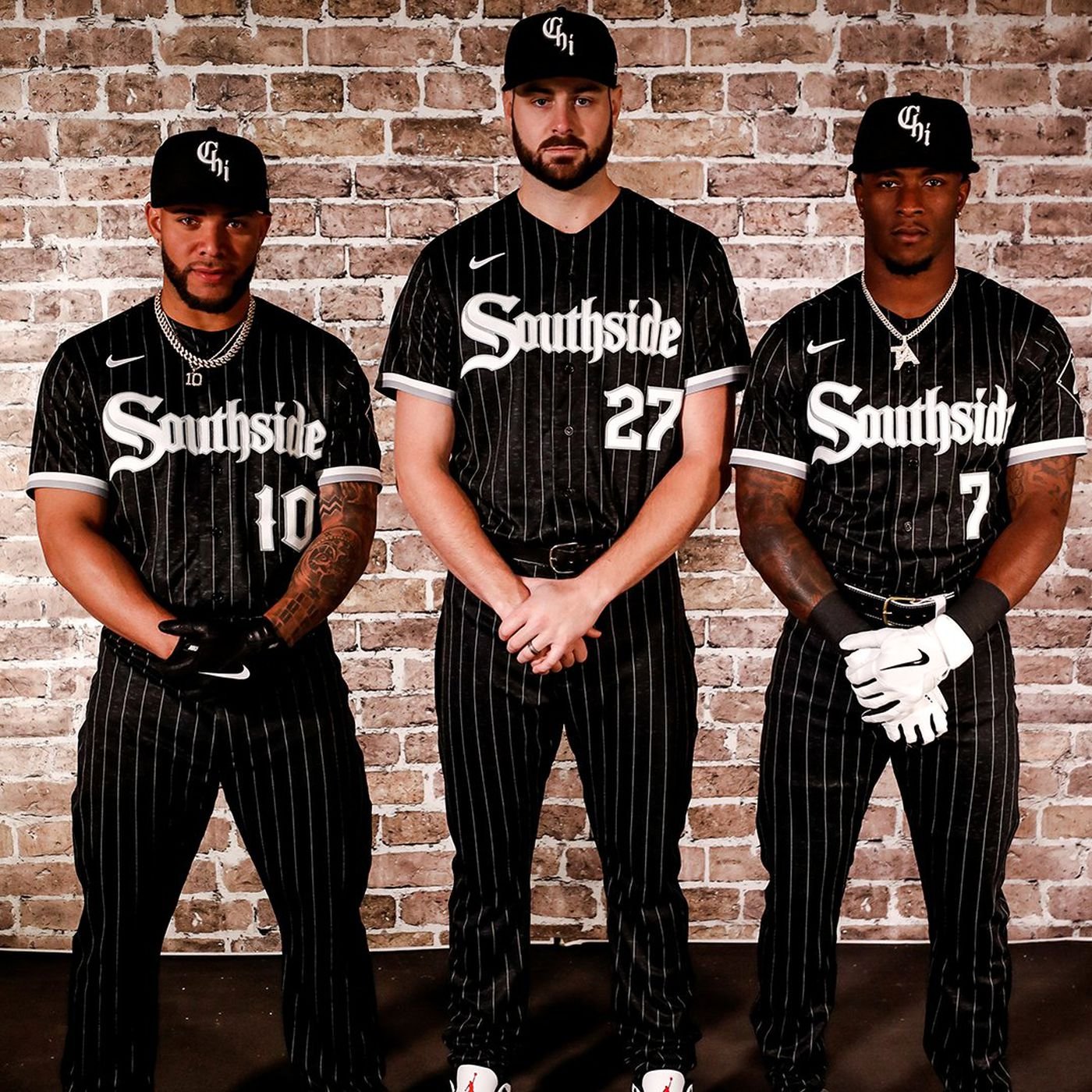
#2 The Chicago White Sox
My original #1 on my first ranking was the White Sox and I still really love these City Connects although now they land at the #2 spot. I love the choice to say Southside with the Gothic font, a tribute to the architecture of Chicago. The fans seemed to love them and they sold out quickly. The uniform finds a way make a big departure from the classic uniform while being creative and different yet still maintaining the classic colors of the team. They were the first team to go away from the white pants and for them, unlike some others, that strategy completely paid off and the all black look with pinstripes looks phenomenal. Even the Nike swoosh looks cool on these because it pops with the white and gray trim. Overall, these are simply fire and I love the White Sox City Connect uniforms.
#1 The Cincinnati Reds
But coming in at #1 is the City Connect uniforms of the Cincinnati Reds – a surprising pick probably but I’ve always loved the combination of red and black, especially with black is the dominant color and that’s exactly what these uniforms bring – an all black look with red highlights and the classic C logo but revamped to represent the continuing growth and change in the city of Cincinnati. The uniform also has a patch with the city's motto "Juncta Juvant," which is Latin for "Strength in Unity," and includes a buckeye leaf as a reference to the state of Ohio. Other than that, there aren’t a ton of references to Cincinnati but I’ve never been there and not sure what Cincinnati is famous for other than producing Steven Spielberg which is greatly appreciated. So, I guess that’s a valid criticism but I think this look so awesome and there is just enough references to Cincinnati and Ohio that I still put it at #1 as my favorite City Connect Uniform.